I must start by saying that this isn’t really about Ikea
– or any other individual case. And it isn’t just about fonts
or typefaces. It’s about websites and why they often don’t
work as well as they should – and communication in general being
in a mess that is going from bad to worse.
The example discussed here is one of many. Companies that
are well known for the quality of their products and services
can “stumble” when it comes to their online
presence (and so do all sorts of organizations, including
governments, public service, newspapers etcetera.)
I am pleased to return, once again, to quoting Gerry
McGovern. On September 21, 2009, he published an article titled
IKEA chooses an ugly font.
There is a lot of fuss about the fact that Ikea changed
the font in its websites to Verdana. This choice is being
vehemently criticized. I am quite surprised, because a few
years ago many website editors claimed that it was the
“ideal” font for online use. They appear to have
changed their minds. Here are some examples quoted by Gerry
McGovern.
«Verdana was designed for the limitations of the
Web - it’s dumbed down and overused,» Carolyn Fraser, a
letterpress printer in Melbourne, Australia, told
Time. The design community is seemingly up in arms
that IKEA would choose a «plain ugly» font.
«Words can’t describe my disgust,» spat Ben
Cristensen of Melbourne. «Horrific,» lamented
Christian Hughes in Dublin.
«It’s more efficient and cost-effective,»
says IKEA spokeswoman Monika Gocic. So,
IKEA has gone cheap
and some think this will damage its brand. «The former
typeface definitely better reflected IKEA’s design
philosophy, giving it a very special, unique flavor that
actually fit the company’s style,» Vitaly Friedman told
Time. Vitaly is editor in chief of the online
Smashing magazine, which is dedicated to Web design.
«With Verdana being used all across the Web, IKEA’s
image not only loses originality, but also credibility and
the reputation that the company has built since the
1940s.»
There are many reasons – rightly comments Gerry McGovern
– to buy from IKEA but I doubt the font that they
use is one of them. IKEA is successful because it makes
stylish, affordable furniture, not because of the font it uses.
Of course no publisher or editor of printed paper, in
his or her right mind, would consider using a typography
compromise such as Verdana (though the use of sans-serif or
other poorly readable typefaces is stupidly spreading also in
books and newspapers.) But it’s interesting to notice this
(somewhat belated) backpedaling by “web specialists.”
I am grateful to a reader for ponting out that, strangely, Ikea is using a Verdana typeface
also in printed catalogs – though it wasn’t designed for that purpose. This may influence, if only partially, the meaning of
some criticisms in one particular case. But it doesn’t change the general picture.
Anyhow it’s ridiculous to claim that this was done to
“save money.” There is no cost reduction by
changing a font (while there are additional costs in managing
the adjustments.)
It’s quite possible (in fact desirable) to be simple
while being elegant (but, as we shall see, Ikea is doing the
opposite.) If they choose to wear a “cheap-looking
dress” the only result they can obtain is to look like a
poor quality product for people who can’t afford a better
one. This isn’t suicide, because one error isn’t enough to
destroy an established reputation. But it’s definitely a
mistake.
As always, Gerry McGovern’s comments are in a wider
perspective.
«You know, this recession can only be good for
Ireland,» the barber said to me. «Irish
people, you know, are a bit brand-loyal. If it’s advertised
on TV they think it must be good. At first they didn’t want
to buy from Lidl or Aldi supermarkets because they hadn’t
been told in ads that they were good. But they’re getting
used to it. And now comes IKEA ...»
The Web is resulting in the bursting of the ad-built
branding bubble because web customers are much more
fact-driven and less emotion-dragged. The very reason you’re
on the Web is because you have not allowed yourself to get
carried away by your emotions. You want to do a bit of
research, get more facts, get the best deal.
On this point I don’t quite agree with Gerry – who, as a
leading advocate of the internet, sometimes tends to
undervalue other communication resources. There is a mixture
of reason and emotion in all human behavior. And
communication is a whole, effective when it’s coherent in all
its ways, clumsy and confusing when it isn’t. It’s even more
important to keep promises, to actually behave as one says.
As I said and wrote many times, the myth of false
“image” with no roots in reality is wrong and
ineffective everywhere, not only online.
It’s no “casual coincidence” that this
degeneration has been spreading in the same years (decades)
as the warping of speculative finance. They were born
together and together they must die, as disease-bearing
bacteria (but remedies don’t seem to be as effective as their
should in preventing or treating the pandemia.)
More broadly – “brand loyalty” isn’t forever. It takes a long time to build trust, much less to lose it. It’dangerous to disappoint a customer (or reader.) And it’s even worse if a competitor is behaving better.
But let’s get back to the Ikea example, because we can
learn a few more lessons. (I checked the following comments
with Gerry by email – and I am pleased to know that he
agrees.)
The choice of a font that “cheapens” the brand
isn’t the only problem – nor the most relevant. I have always
been asking myself if it makes sense fo “force” the
typeface online. And in practice I never do so. (If, as it
can happen, that font isn’t in the reader’s computer it
turns into something else – in ways that it’s practically
impossible to verify.)
We must go back to the basic principle that the internet
is “a varying reception environment.” The most
effective solution is to let it be so. If we don’t
“set” a font, readers read with whatever they have
chosen. (Or if they didn’t deliberately choose, and are
seeing whatever is the default in the software or was set by
a technical assistant, that is what they are used to.)
Does letting the reader choose make the site less
distinctive, more commonplace? It’s the other way round.
There are only a few fonts that “probably everyone
has.” So that can’t be a way of “looking
different.”
It’s much more important, to set a distinctive identity,
to have something relevant to say right away, that isn’t the
usual boasting, pompous self-praise or pointless glitz. And
an immediately visible structure that makes it easy to find
what is interesting for the reader.
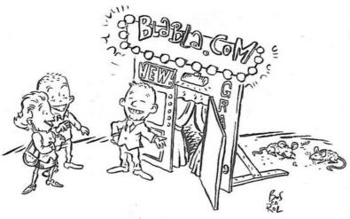
Blowing up appearances instead of content doesn’t only
look like everybody else (because the gimmicks are often the
same) but tends to identify at first glance with the worst
websites, those that hide the lack of meaningful information
behind loads of cosmetics. It isn’t a good idea to
concentrate on an “image” that is often the label
of emptiness.
But there is more. After reading abut the debates on this
subject, I tried to look at Ikea’s websites. I couldn’t,
because nothing can be seen unless I install “the
lastest flash software”. I have no desire whatsoever to
do so. That isn’t only because I don’t enjoy
“flash” animation. It’s also, quite deliberately.
to avoid websites starting that way – they are generally
those that I don’t care to explore. So I dont’ waste my time
and move on immedately to somewhere else where I can find
what I am looking for.
Are there many people who carelessly let themselves be
“updated” with all sorts of software that they
don’t need? Probably But this isn’t the point. The fact
remains that too much decoration is distracting. The more
people are experienced in the use of the net (and therefore
they are the best potential customers) the sooner they get
bored with unnecessary “dressing up.”
The solution is extremely simple. Even for those website
owners who absolutely want to have such an appearance, it’s
technically easy to offer a “no frills” alternative
that goes directly to content. Why do so many (including
Ikea) not understand that they can – and they should?
It’s true that I have been online for seventeen years and
many other people have less experience. But people like me
aren’t an exception. While in a conversation, or when we are
reading, minutes or even hours can go by pleasantly with no
feeling of boredom, online a few seconds before getting to
what we are looking for feel like eternity. And it is so for
everybody.
Are there newbies who are just surfing around and enjoy
the entertainment? Maybe. But they aren’t the best customers
or prospects. And it won’t take long for them to become fed
up and start looking for something meaningful.
The time has come to understand that any site not
offering efficient service to readers (instead of
cosmetic glitz) deserves to be dismantled and stored away in
a dusty cupboard – or in some dark museum of horrors. This
was true forty years ago, when the internet was in its
infancy, or twenty, when the web was beginning to develop.
Now, with the ever-growing size of the net, it is even more so.